Nice Charts. Was Hoping for Answers.

I always thought that the better a report or chart looked, the more valued it would be. I was constantly chasing the next BI tool or Javascript library (looking at you D3) that would make my visuals stand out or be considered "cutting edge" as I figured that’s how I would separate myself from the competition. Having the snazziest looking charts would feed into a portfolio that any employer would gush over.
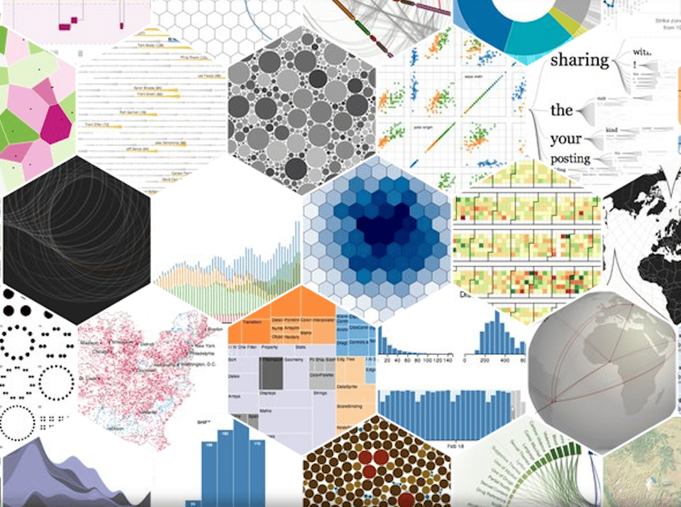
And I wasn’t alone with this train of thought. In fact, there is a massive market related to data visualization. There are books, courses, certification programs, and even entire conferences dedicated to the subject. I’ve seen estimates that claim the data visualization market was valued at almost CAD $16 billion in 2023 and could hit CAD $42 billion by 2032.
With all this hype it’s easy to see why it took me way too long to realize one career changing truth.
Key Takeaway - Stakeholders want answers, not pretty pictures.
As soon as I realized this, I changed how I approached building dashboards. My method shifted from aesthetics-driven to asking questions that optimized for the highest likelihood of being used. When tasked with building a report or dashboard, I ask stakeholders:
- What questions do you want answered by this report?
- How will the answers to those questions be used in your organization?
- Could the answers potentially change how you operate?
These questions serve a couple of purposes. First, the stakeholder will have a sense of excitement because this future report will likely inform their strategy. Second, it refines the request to only include important information, as opposed to 'nice-to-have' data.
But these questions alone won't do the trick. There are two more steps needed for this methodology to work.
- Set up touch points along the way to allow for course-correcting and instilling confidence that you’re on the right track.
- Present the report live and show stakeholders the specific steps to take to get the answers to their questions. If you can’t do this, consider pre-recording a walkthrough. Adding a glossary can help too.
At the end of the day, no one’s opening a dashboard to admire your design choices. They’re trying to make a decision. Help them to see your dashboards as a strategic recommendation tool.